Week 5 Finding the GOLD in DATA
In this lesson, we mainly learn how to process the collected data
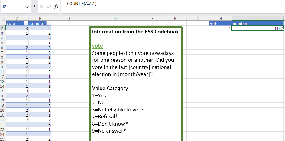
By calling Excel functions, we can easily adjust the existing data table. For example, using the count function , we can easily count the number of people selected "YES" , as shown in the figure below.
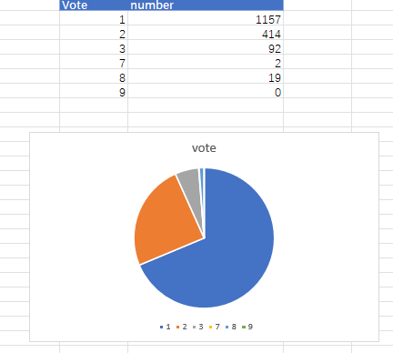
Continue to do this, and we can get the total number of people who voted. However, such numbers are not easy for readers to intuitively feel the situation of different votes, so we need to change the presentation method. Among all the charts, pie charts are relatively suitable for presenting different proportional relationships. With the help of Excel's built-in charts, we can present such a picture
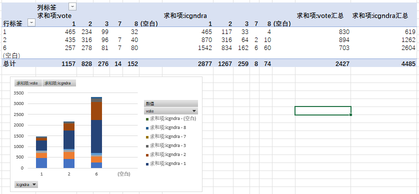
In this case, we can see the voting patterns of different genders.